


Steal the Technique of the Greats: Mastering the Art of Lettering
Make your practice count with the technique employed by the great lettering artists of the past

After a month of exclusively drawing on the iPad, I was reminded of my initial experience with lettering. It all started a few years ago with The Futur Academy's Lettering 01 course, taught by Nils Lindstrom, a typography professor at Art Center. As a self-professed fanboy, I couldn't resist the opportunity to learn from Lindstrom, who was a contemporary of the renowned Doyald Young, also a professor of lettering at Art Center.
Under the guidance of Lindstrom’s voice and Young’s books, I delved into a valuable lettering technique that helped me develop a profound understanding of various lettering styles. The results were nothing short of stunning—a meticulously crafted, intricately detailed pencil sketch.
Today, I am excited to introduce this technique so that you can give it a try for yourself!

The precarious era of the sketchbook and tactile screens
While the convenience and speed of using an iPad and sketchbook for both practice and client work are undeniable, I've personally felt the absence of the control and precision that a trusty lead holder provides.
Sketchbooks and tablets have been romanticized throughout the web. Growing up surrounded by art, particularly on YouTube and blogs, it seemed as though you weren't a "real" artist without a filled sketchbook, or that you could never achieve Disney standards without a drawing tablet.
I can't say for certain if these statements hold true, but I'm confident that both methods—the sketchbook and tablets—can inadvertently invite bad technique. By bad technique, I mean deviating from the approach advocated by artists like Young and Lindstrom, which can hinder your learning process. It's almost as if these methods don't provide the ideal environment—comfort and tools—to fully grasp and execute letterforms, especially for beginners.
Limited canvas, limited results
In conclusion, before I dive into the details of the sketching technique, I want to share why I believe it surpasses both the sketchbook and the tablet as a method for learning.
I vividly recall a time when I would struggle with drawing on a blank A4 sheet of paper, whether it was standalone or within a sketchbook. I could never accurately predict the length of the lettering, resulting in incorrect proportions and lacklustre compositions. I felt restricted by the paper and frustrated by my perceived inability to create beautiful artwork.
However, it wasn't the fault of the A4 paper sheet itself but rather the context of 'quick sketching' that surrounded it. I would spend hours sketching without experiencing any noticeable improvement due to a lack of deliberate practice. The technique or drawing method I'm about to introduce is not radically different, but it provides the optimal environment and tools to rapidly develop proficiency in various styles. Once you graduate from this technique, tackling the sketchbook will feel much more manageable and enjoyable
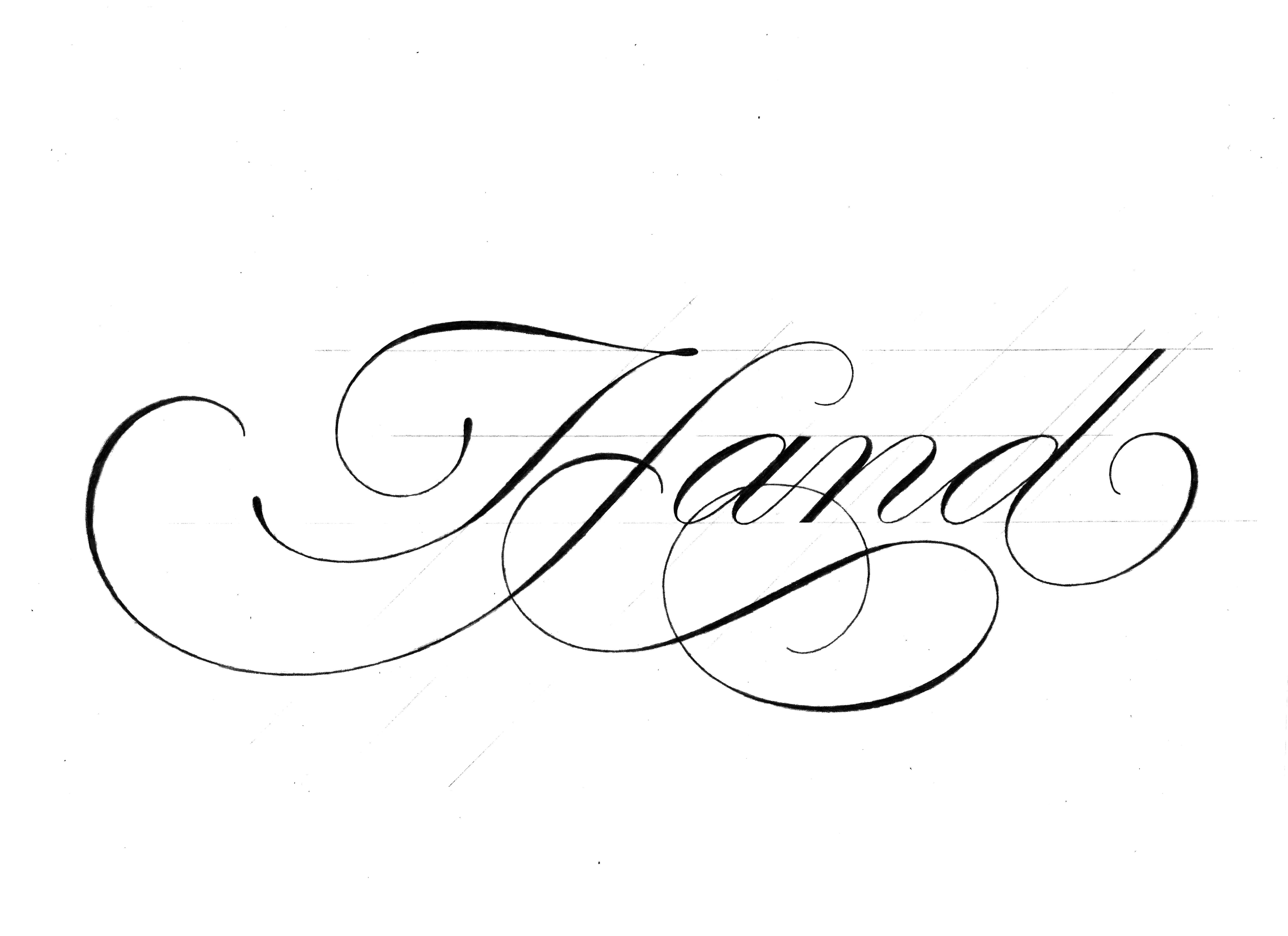
The Technique
With all this build-up I made it seem like I’ll be presenting something groundbreaking but in actuality, it’s pretty straightforward.
“I begin the design process in the same way that I first learned how to draw letters: with an HB pencil on tracing paper at a small size.”
Doyald Young, Graphic Designer & Teacher
Tracing paper often gets a bad rap among designers, but in my experience, it is the secret ingredient of this technique. The way the lead softly interacts with tracing paper, as opposed to printing paper, creates a distinct result. More importantly, it provides a unique tactile experience that sets it apart.
1. The setup
To make this technique work effectively, it's important to create a spacious working area. I suggest adopting the same budget-friendly setup that I use. Clear your desk, allowing ample room for your arms to move freely, as if you were DJing. Personally, I prefer to work within a space roughly the size of an A3 sheet of paper. Since my table has a textured surface, I tape an A3 bristol board to it. Alternatively, you can use graph paper, which provides helpful guidelines for lettering.
Now that your improvised drawing board is ready, here’s what you’ll need:
Tracing paper (roughly A3 sheets); I use mostly student-grade materials when practising, which means a roll of baking paper is fine.
A sharp pencil; Ideally, a 2mm Lead Holder with H to HB leads; 2mm Lead Pointer.
Eraser and eraser shield.
Ruller.
You can find the material I use here.
2. Placement
When working with a lead holder, it's important to keep the lead sharpened and apply minimal pressure to the paper. I hold the lead gently, slightly above the metal grip, to achieve this. I also recommend extending the lead a few centimetres out of the holder for better control.
Depending on the style and weight of the letter, I may begin by sketching its skeleton. However, since it is a sketch, I draw loosely and always add weight before moving on to the next letter, similar to the process shown in the video above (available on the web version of the post or the Substack app).
3. Referencing
I used to be tempted to draw from memory, fearing that relying on references would result in mere copies. However, I've come to realize that this mindset can lead to poorly drawn letters. The right answer lies somewhere in between.
“Beginning with a model as a foundation, letterers can alter various aspects of the letters’ appearance to suit a given situation. […] By studying traditional sources, you learn the essential qualities of each style […]”
Ken Barber, Lettering Manual (House Industries)
In conclusion, it is important to go to the source, familiarize yourself with the style, and then apply it in your unique way. Avoid copying or tracing directly, but rather have the reference material by your side for study and inspiration.
The Lettering Manual by Ken Barber is an excellent resource with a wide range of great models to explore. Additionally, I recently acquired a copy of The Calligrapher's Bible, which has proven to be valuable.
4. Refinement
Once the initial sketch is complete, you have a few options to refine it further. One approach is to trace the sketch multiple times using tracing paper, allowing you to make adjustments and iterate as needed. Another option is to scan the sketch, enlarge it to fit an entire A4 page or similar, print it out, and then trace over it to correct any details.
Alternatively, you can use a light table to trace the lettering onto a sheet of higher-weight white paper, which provides a clean and precise result. Lastly, if you prefer a digital approach, you can refine the sketch using a digital tablet.
5. Further observations
In conclusion:
Make it enjoyable by selecting a word or phrase to letter.
If creating a complex composition, begin with a thumbnail sketch.
Otherwise, start with loose and light strokes, gradually refining your sketch.
Begin with a small size, aiming for a 2cm x-height or similar.
Strive to create a final artwork that is ready for vectorization.
Closing note
Can you achieve similar results with a different method? Absolutely! However, I find that drawing on tracing paper, with calm and intent, is not as widely encouraged nowadays. I attribute a significant portion of my growth as a letterer to the practice and refinement of this technique, and I believe it holds great value for both beginners and professionals in the field.
What are your thoughts? Have you found this technique to be valuable?
Let's start a conversation and discuss it further!