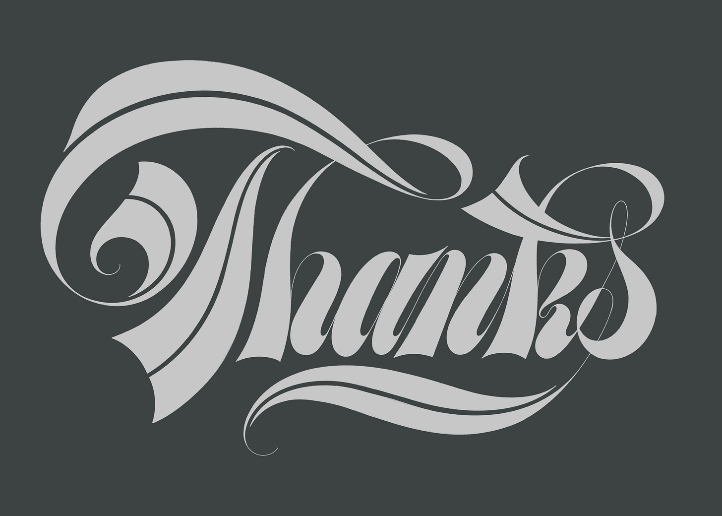
Introduction to Spencerian Script Studies
A closer look at the style's features and lowercase letterforms
Hi everyone,
Allow me some time to figure out the best course for Ascent. For now, I would like to introduce you to some thoughts on Spencerian Script that I’ve been playing around with.
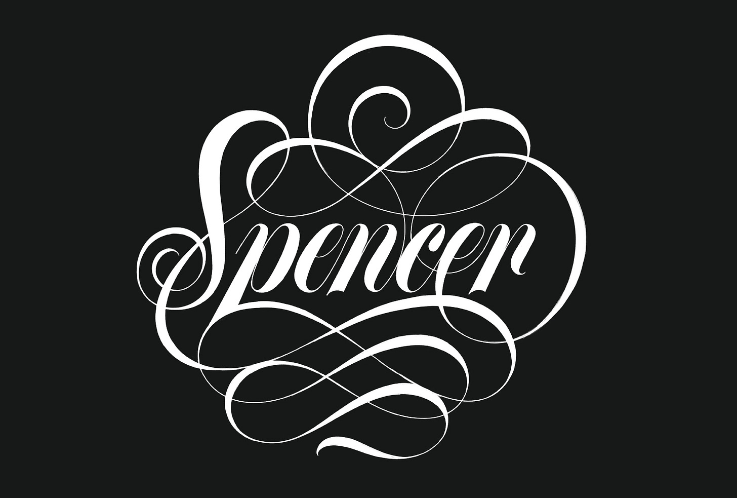
Spencerian script is a showstopper! So, let’s stop and reflect.
I momentarily gave up on researching the exact reason why Spencerian came to be the extravagantly flourished style we see today. Instead, I'll assume that 20th-century lettering artists picked the Copperplate-based writing style, attributed to Platt Spencer, and elevated it over the years in a feat of virtuosity. Now, let's observe their creations.
As the master Tony Di Spigna puts it,
“The [Spencerian] designs speak for themselves and in my view require little explanation.”
Thus, today, I would like to share with you three observations that I was able to pinpoint after having closely studied the lowercase letterforms of this style.
Weight
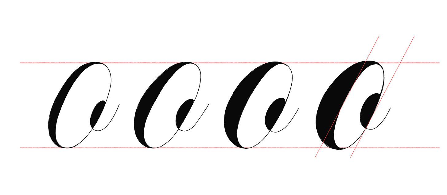
If you take a close look, the style is distinguished by its high-stroke contrast and bold letters. That is not the case in many calligraphy models since some of them can have no contrast at all. However, examples from master letterers of the past century show a tendency for narrow, bolder, and squarer letterforms.
One peculiar attribute of these letterforms is the straight counters (above - the last figure). It looks like the bolder the letter, the less curvature it has.
1. Spencerian script tends to be narrow and bold.
Weight transfer
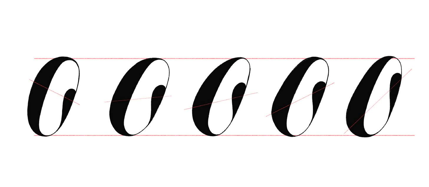
The carriage of weight around the bottom of the joining curves of script letters is common, especially in bolder weights. The main difference between this feature in Spencerian versus other styles is that this is not only desirable but almost imposed.
I noticed that bolder letterforms, in particular, require some level of weight transfer to appear cohesive. Note that some carriage of weight around the top curvature is also common, just not as noticeable in most cases.
Nonetheless, we as letterers can increase the weight transfer (above - the last figure) or ignore it and make it completely absent as a design feature.
2. Some weight transfer is called for in the Spencerian script letterforms.
Stress
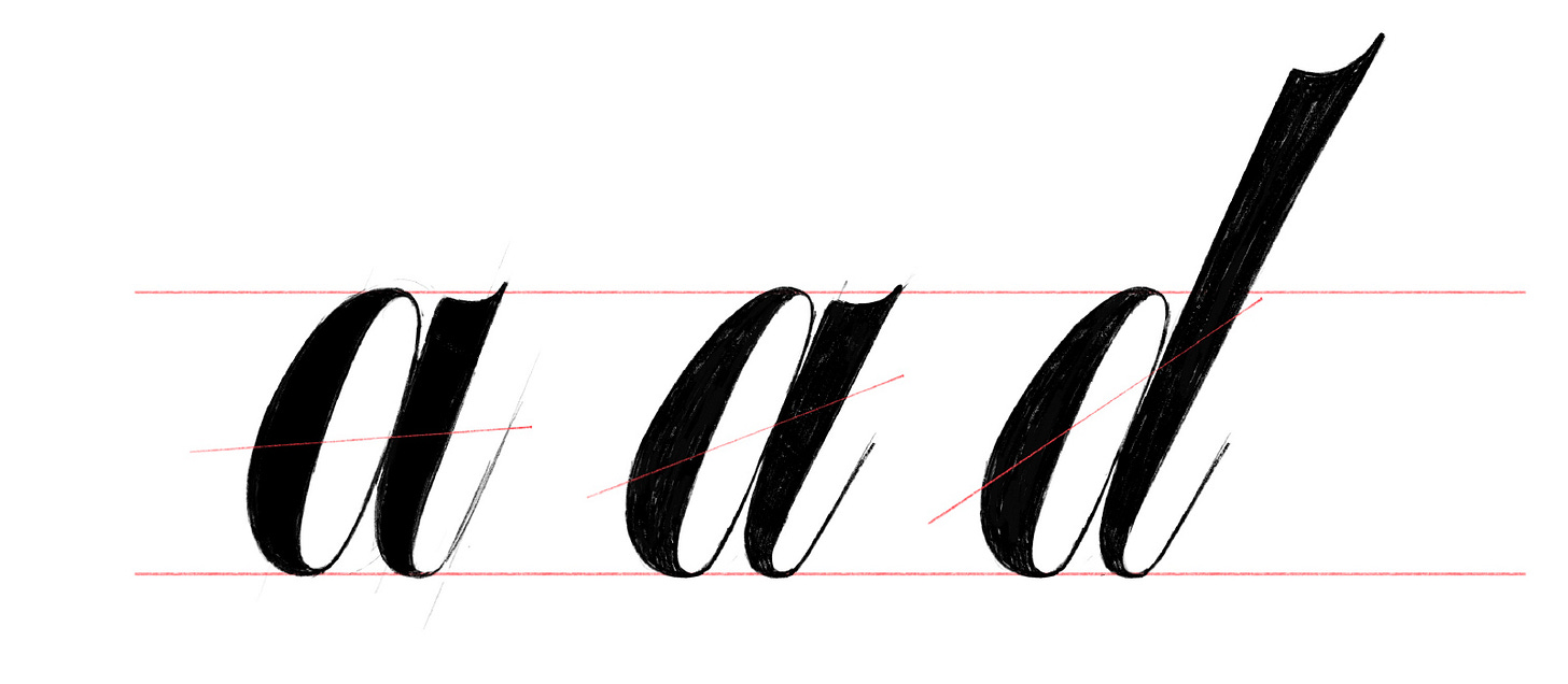
To conclude this line of thought, I must share a remark on stress, which refers to pressure points and the angle at which they occur.
Some calligraphy training is overdue to fully understand this one, but it should suffice to note that the heaviest spot in lowercase Spencerian letterforms tends to appear under the midpoint of the x-height in the lobes, and above that midpoint in the stems. However, there’s no hard rule.
3. Stress, as it relates to the heaviest spot and the shift from thin to thick, is a distinctive feature of the Spencerian style.
Ending note
I still struggle to describe Spencerian Script on paper but I don’t fail to identify a design in this style when I see one.
In my view, there are distinguishing features that separate the Spencerian from other formal scripts that make it worth studying as a commercial lettering artist. That’s why I’m interested in sharing more of my insights on it with you.
What do you think? Are these insights helpful?
Start a conversation today!
Thank you for reading. See you in a week or so!
PS: All sketches were made in Procreate (iPad).


